
About
ASUCLA Art in the Union takes the place of the former Student Commissioned Art Program, which started in 1972 and commissioned more than 60 pieces of original artwork over 30 years. In 2003, ASUCLA modernized the original program and created Art in the Union as an opportunity to honor excellence in the visual arts. This contest allows UCLA students to showcase their talent and gain recognition for their work. In addition to highlighting the skills of talented UCLA students, the program adds to the growing art collection that graces the walls and corridors of the ASUCLA Student Union.
2026 Winners
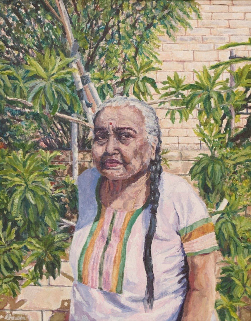
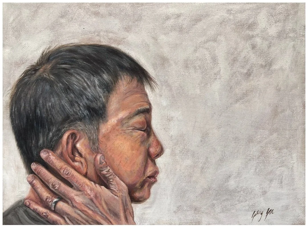
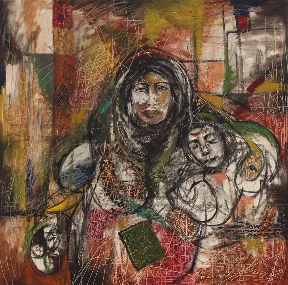
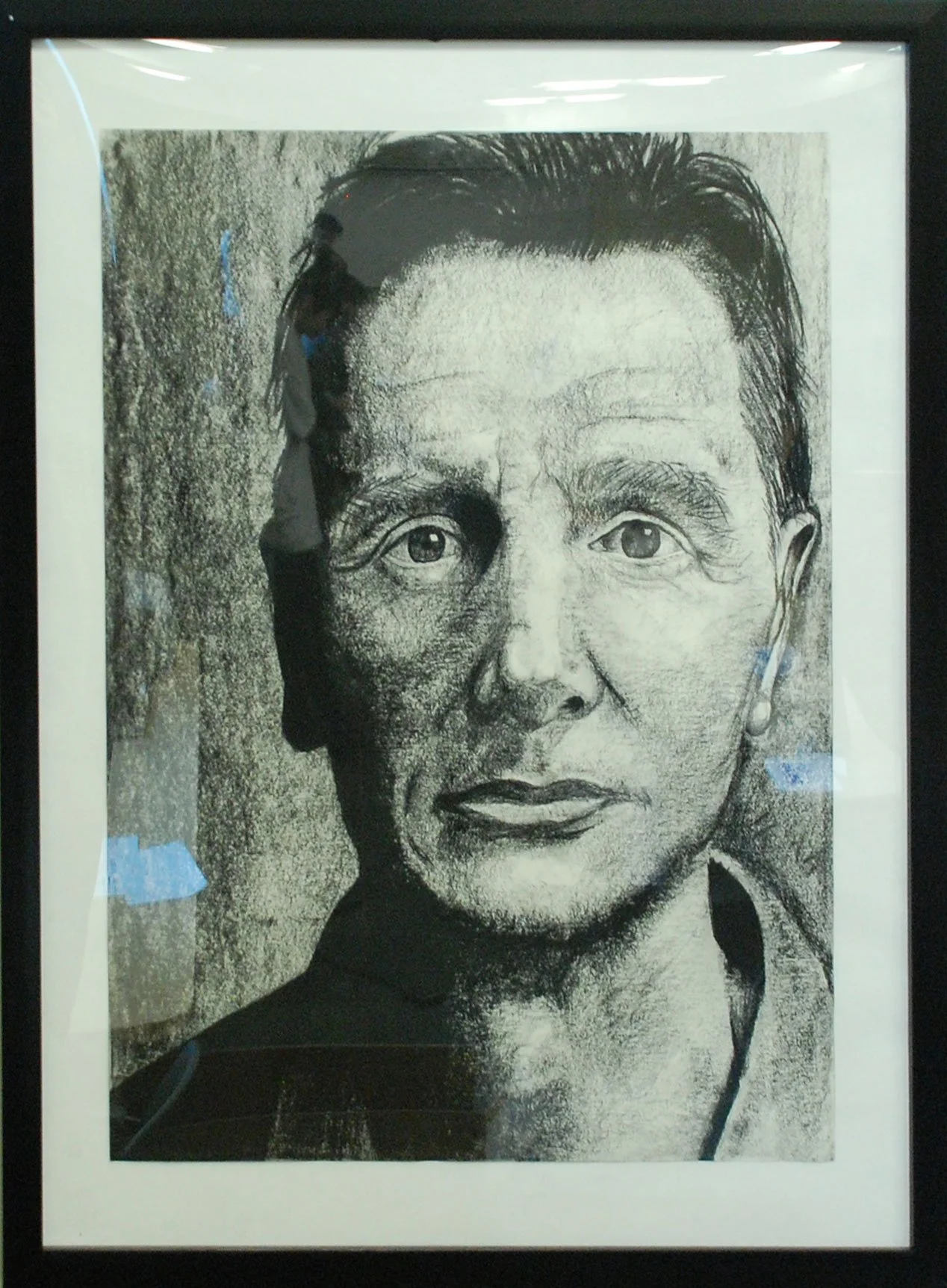
Shreya Patel “Untainted”
First Year, Biology
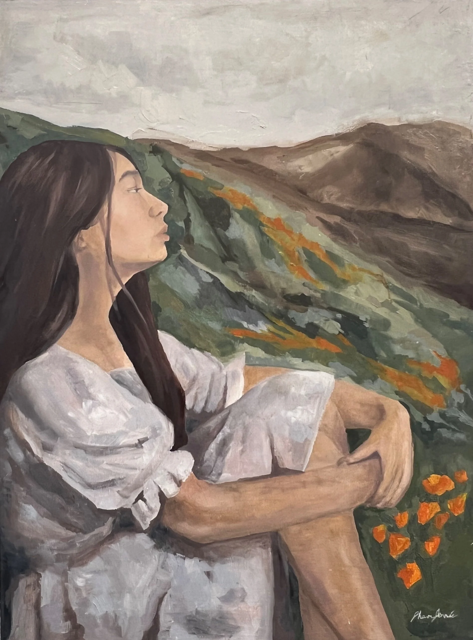
Before sketching this piece on canvas, I used my digital camera to photograph my grandmother in our backyard to use as a reference for my drawing. When creating this portrait I layered acrylic paint starting with dark colors to light to build proper contrast. In order to complete the fine details, I used posca paint pens for better accuracy.
I was inspired to make this piece because I wanted to highlight the beauty of natural life. Current media puts the idea of maintaining youth on a pedestal, with online filters, editing, and rising use of plastic surgery. Furthermore, the world has begun to stray away from its origins as natural habitats are becoming scarce due to clearing of land for supplies and data centers. As technology begins to advance for the better and the worse, I wanted to paint something that shows purity in our natural state of being. This image is of my grandmother who has spent her life working to support her children and taking care of me. The wrinkles and gray hair she carry, come from the hardships and wonderful memories she has experienced during the inevitable process of aging. I wanted to demonstrate how aged features are beautiful and are capable of telling a story. To further portray a pure image of life I decided to include homegrown plants from our backyard surrounding her figure. This image shows her life. surrounded by life itself, whose allure is often overlooked because of current idolizations of being forever young.
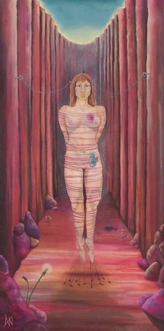
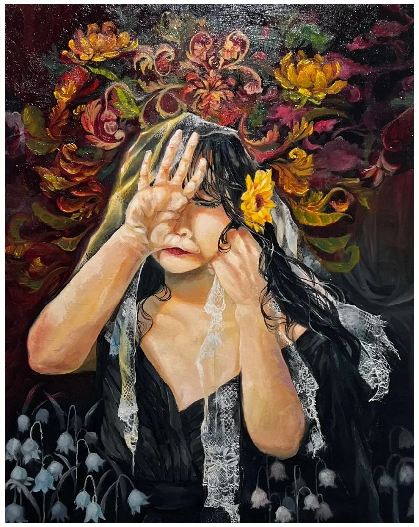
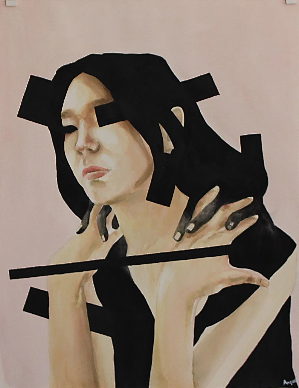
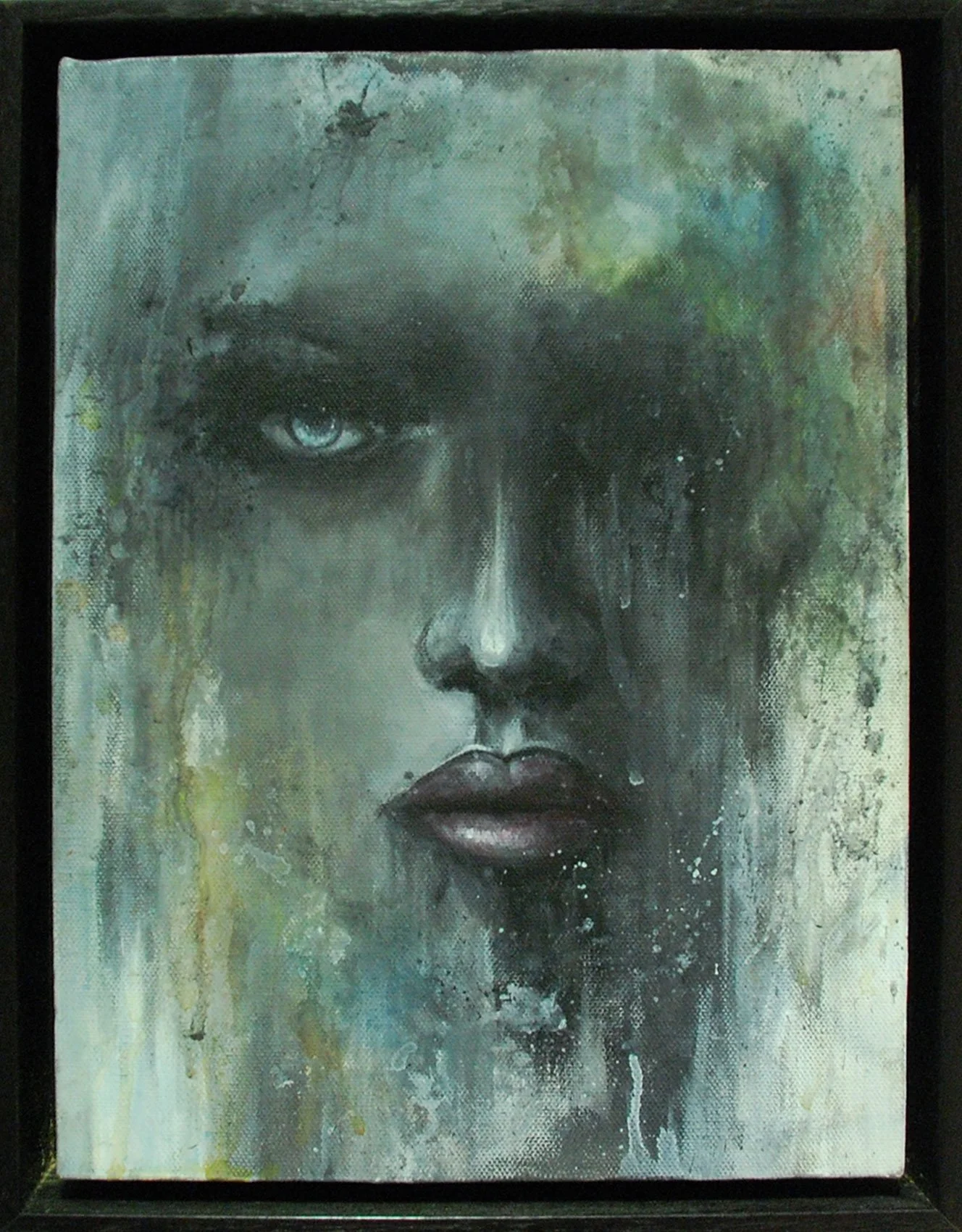
Angelina Porsio “La Callada”
Second Year, Fine Arts
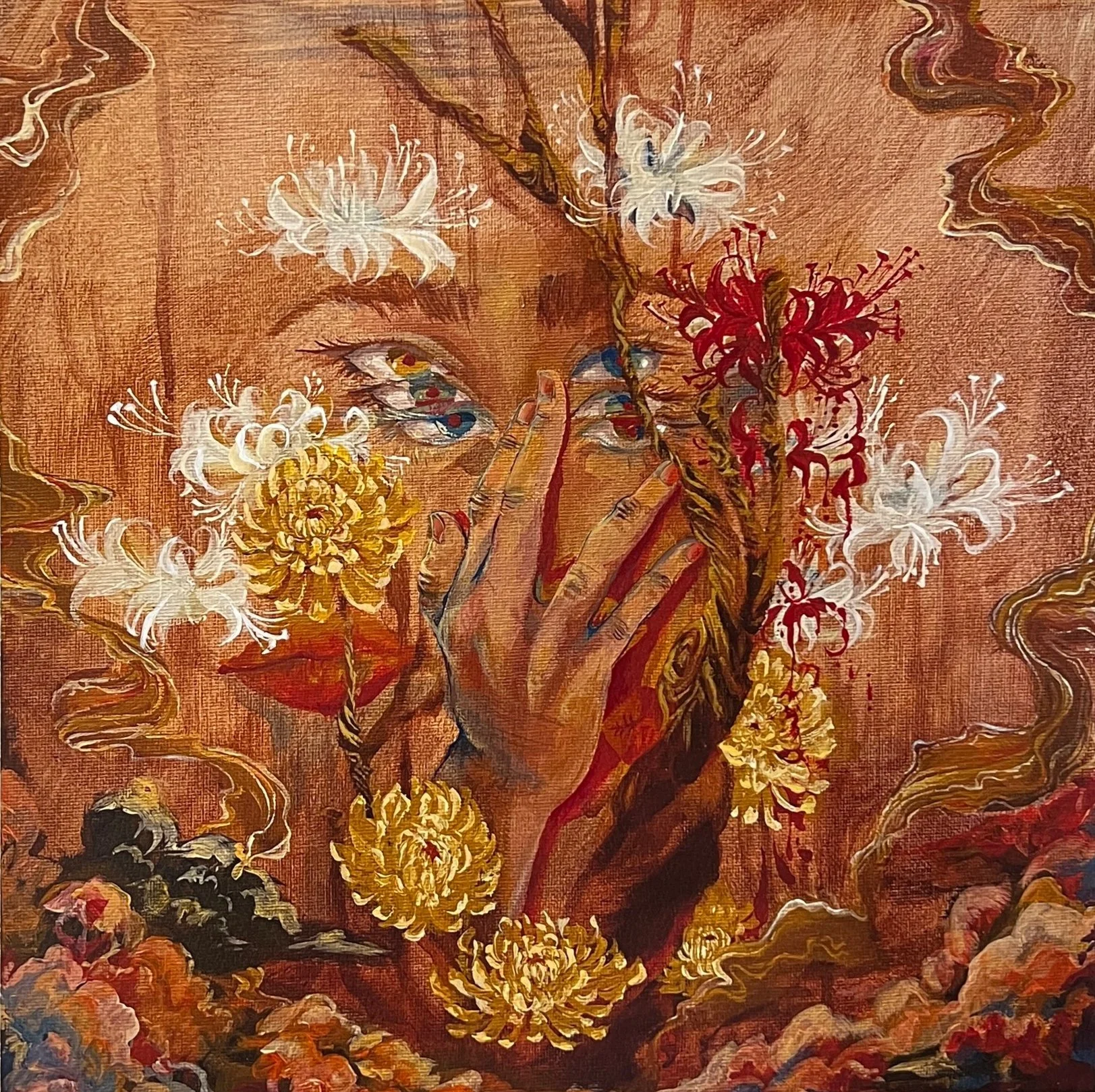
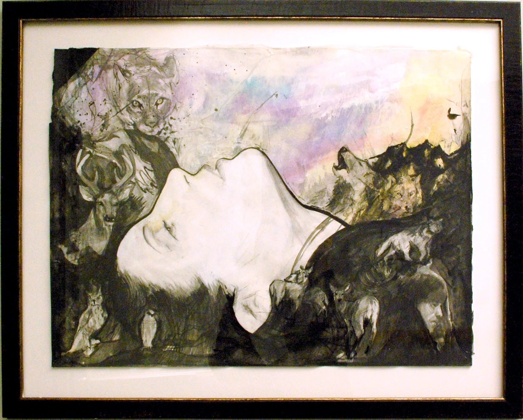
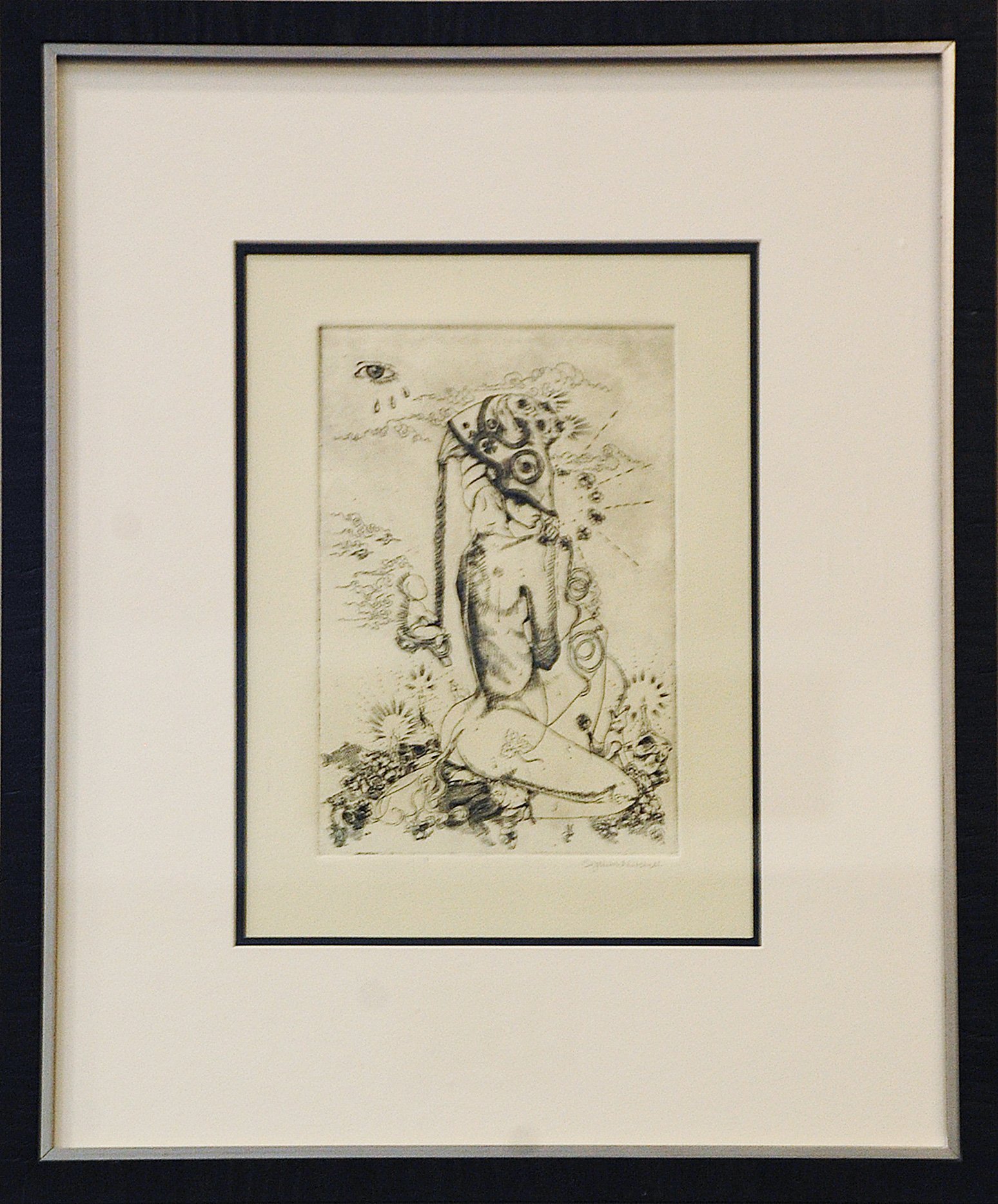
It is part of a series of five works that explore anxiety through the lens of the five senses. Each piece depicts a creature limited to a single sense, symbolizing how individuals and society often recognize problems yet choose inaction, despite having the capacity to respond, act, solve, or face. In this work, the figure exists in a state of intensified consciousness while also being completely constrained. The subject is bound by delicate strings held down by ants, suggesting that the constraints are fragile and easy to break out of, yet remain unchallenged. This tension reflects the internal struggle of recognizing one’s ability to act while still choosing passivity. The figure’s head is tied to the surrounding desert walls by chains, representing the weight and persistence of anxiety, which is also much harder to detach from the mentality than the physical body. The environment itself becomes vast, isolating, and inescapable. The heart is visible beneath the skin, pierced by needles, emphasizing emotional vulnerability. Love and emotions are involved in the pain and distress. There are additional elements that reinforce the theme of quietness. A dandelion occupies the mouth, preventing speech or expression, while the subject’s eyes remain open, signaling awareness and consciousness. Despite this awareness, the figure remains immobilized, embodying the conflict between perception and action. This piece seeks to offer a commentary on avoidance, how individuals and societies often recognize both problems and solutions, yet remain constrained by fear, anxiety, or choice.
I began this series by creating surreal, almost unrecognizable creatures. However, when I reached the fourth piece, I struggled for a long time to define what this creature would be. I spent months thinking about it and even stepped away from the series for a period of time. Eventually, I felt drawn back to it and began brainstorming again. That’s when I realized that all of the creatures in the series represent different parts of myself. For this piece, I decided to be more direct and honest by portraying myself in a vulnerable state, becoming the final and most personal “creature. “I started with sketches of my own body, experimenting with different poses, but none felt right. I ultimately chose a still, restrained position. Unlike the other creatures, this figure is fully conscious, my eyes are open, but physically and emotionally restricted. My body is tied, my mouth is occupied, and my heart is visible, emphasizing both awareness and vulnerability. In the earlier pieces, the compositions placed the creatures toward the sides. In this work, I positioned myself at the center, with the environment drawing inward toward a central point where the sun is located. This choice reflects the idea that I am the source and connection between all the other creatures in the series. I began painting with the figure, then developed the background, followed by the sky, and finally added the smaller elements such as the dandelions, rocks, strings, ants, and chains. After originally completing the piece, I realized there was not enough separation between the figure and the background; they seemed to exist on the same plane. To fix this, I revised the lighting by adding stronger contrast. I darkened the foreground, added light toward the center, and deepened the blue in the upper sky to create more depth and better define the focal point.
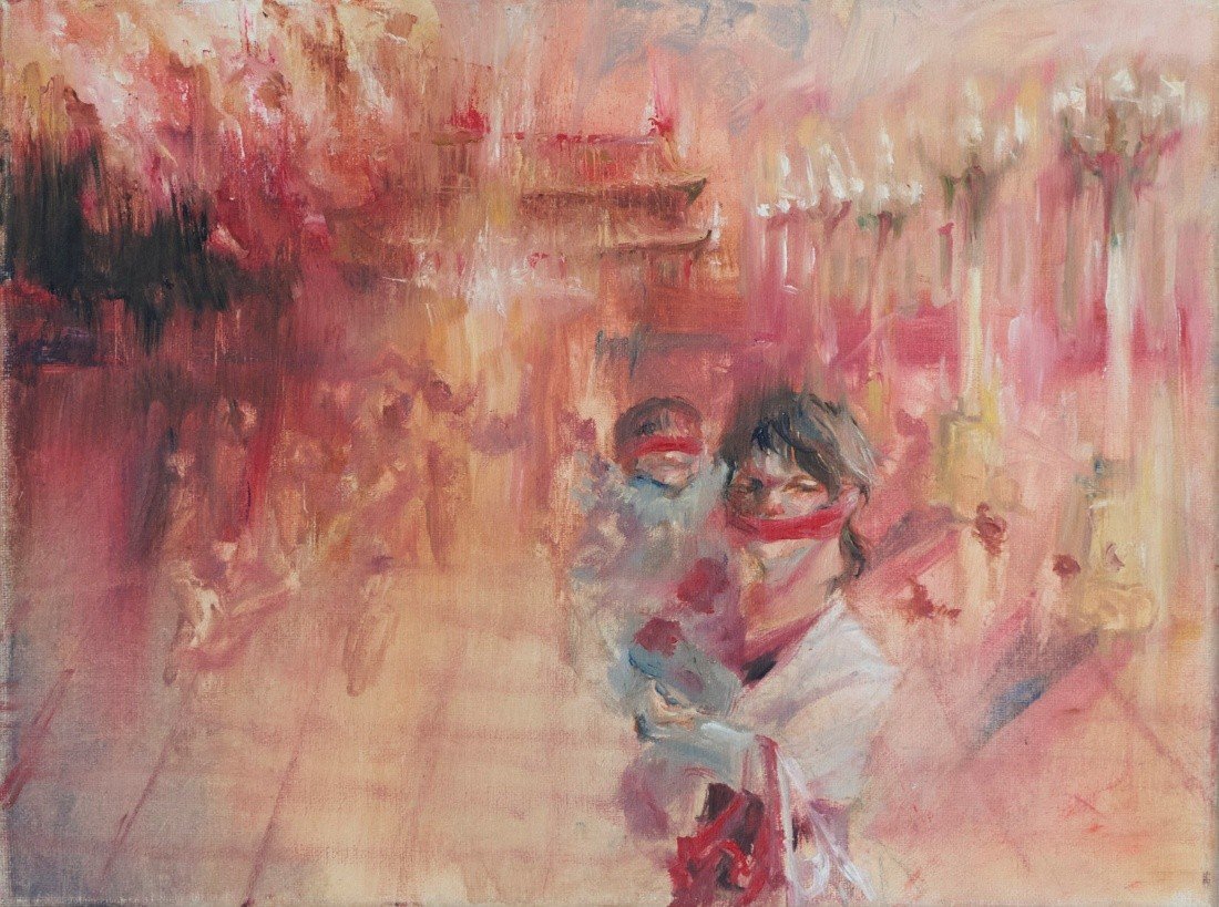
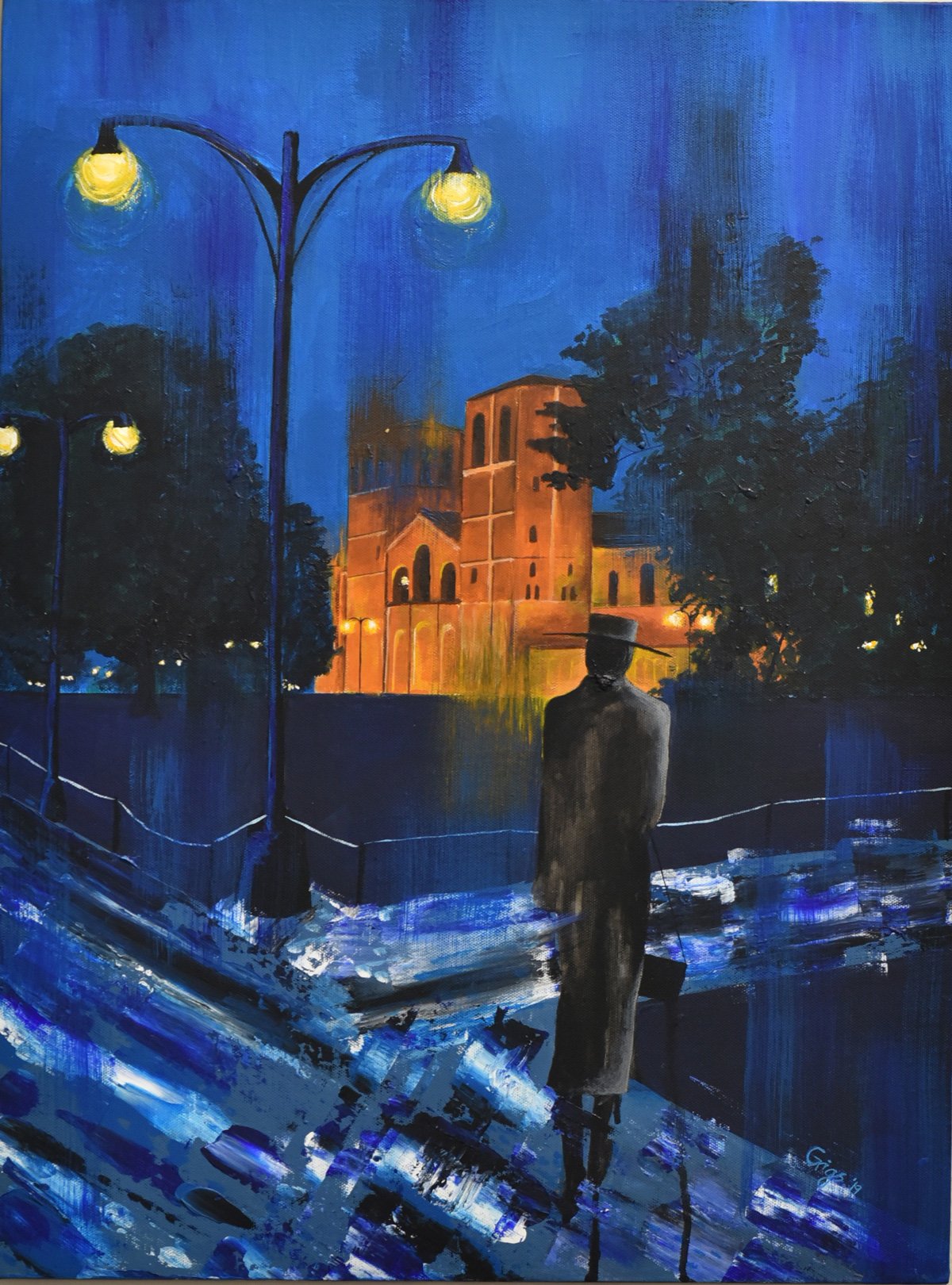
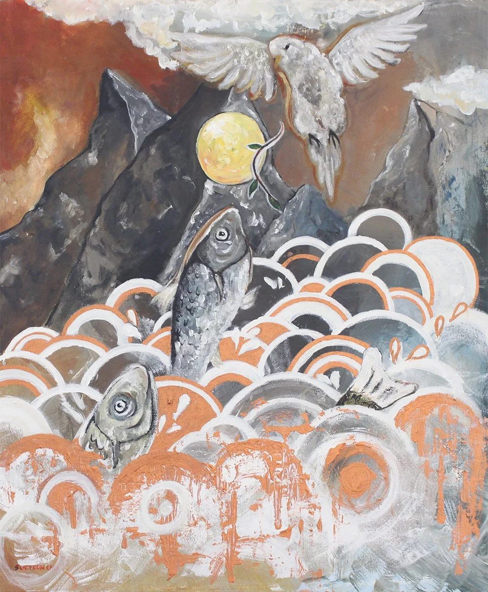
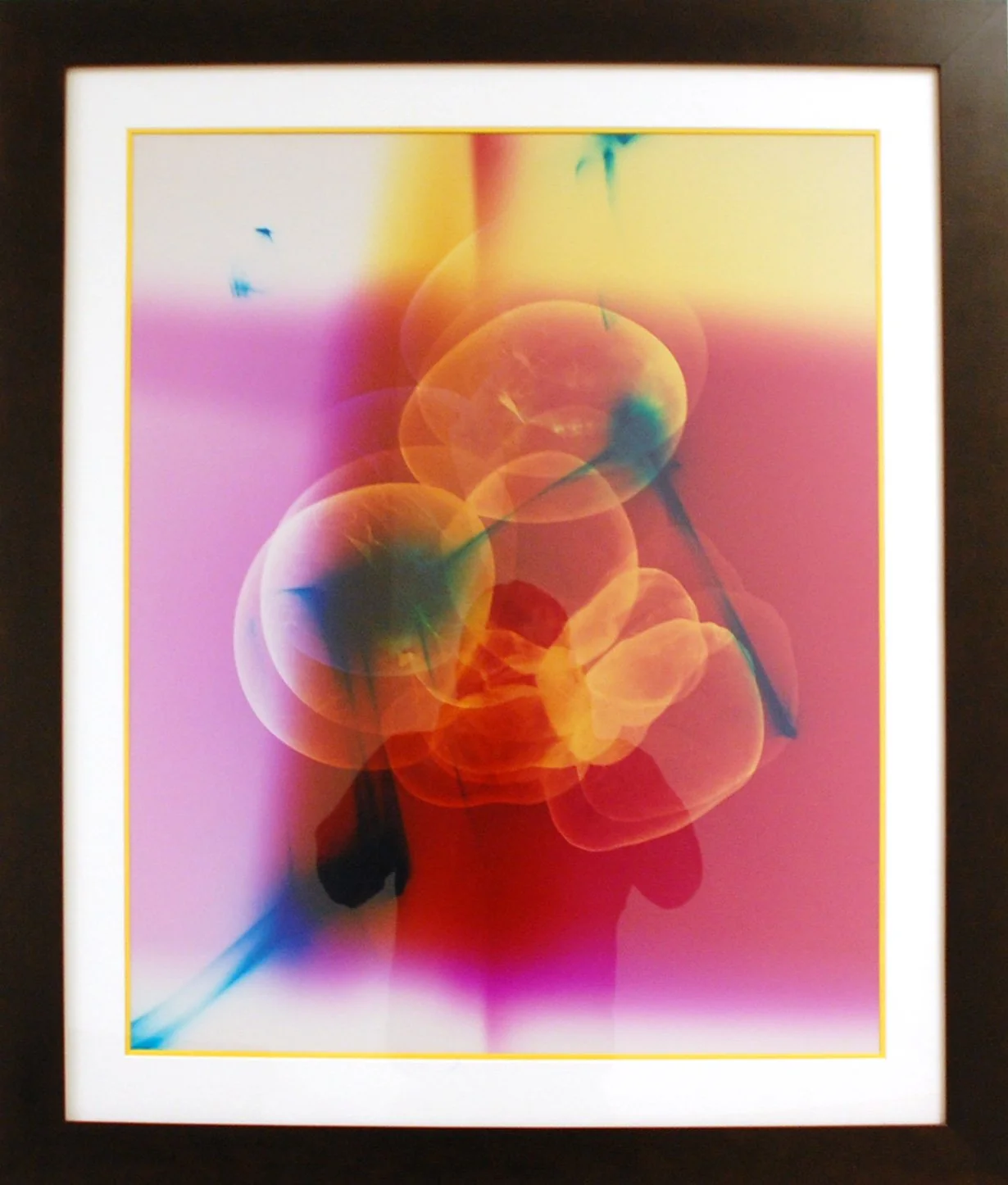
Catherin Xie “Gates of the Forbidden City”
Second Year, Chemical Engineering
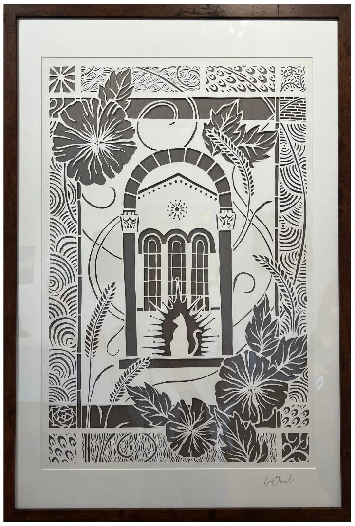
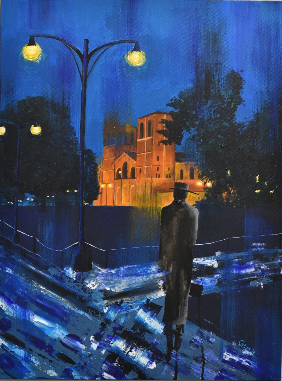
I began by heavily diluting my oil paints with linseed oil to an almost watercolor-like consistency. To simulate a surrealistic “fire”, I built up thin glazed layers of red, orange, and yellow. As I added layers, I gradually decreased the amount of oil to build texture. Between layers, I used turpentine to carve out cloud-like formations. Finally, I defined details for the figures, building, and lampposts to define a solid, grounded presence against the background.
This piece is a critique of totalitarianism, inspired by my father’s first-hand experience in the 1989 Tiananmen Square protests as a college student. Therefore, I chose familial figures as centerpieces. The cloth over my mom’s mouth is a physical metaphor for the oppression of free speech under a totalitarian government. The cloth over my brother's eyes is symbolic of childhood innocence, sheltered from the politics of the world around him.
2025 Winners
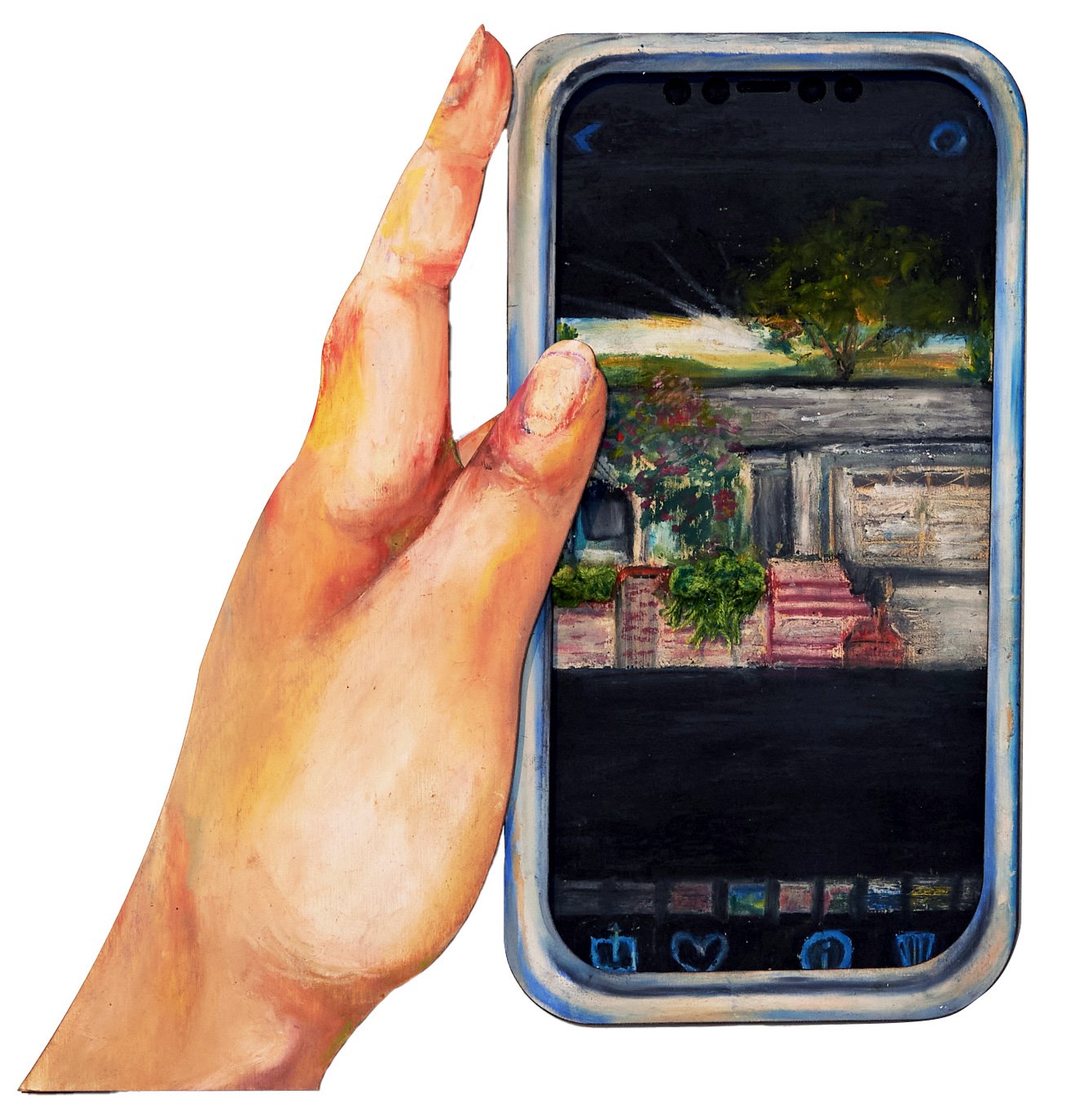
Madeleine Tsoi “Out of Storage”
Second Year, Bioengineering
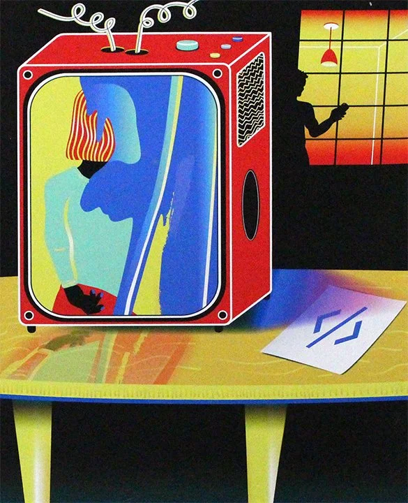
I layered three pieces of wood to create a 3D effect, first designing each piece in Adobe Illustrator. After cutting and engraving, I colored the wood with oil pastel and assembled the layers. Finally, I knitted balls of green yarn and glued them onto the wood to resemble shrubbery spilling out of the phone, physically popping out.
My family moved out of my childhood home while I was at UCLA, and I realized too late that I hadn’t taken enough photos. I combed through my drive, but I could only find fragments of it in backgrounds. Instead, I drew my home from imagination. This piece reflects how memories resist containment; no amount of digital storage can fully capture the emotional weight of those hazy, childhood years, no matter how hard we try.
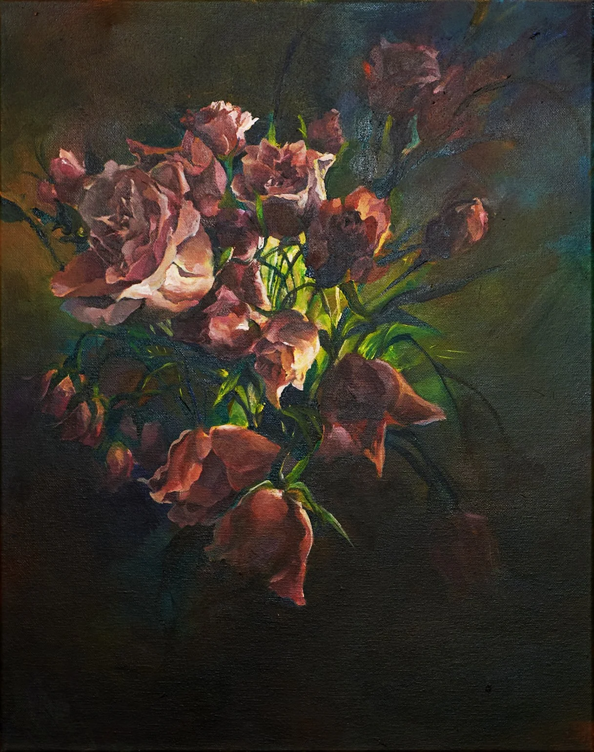
Michelle Lin “Resilience in Bloom”
First Year, Statistic and Data Science
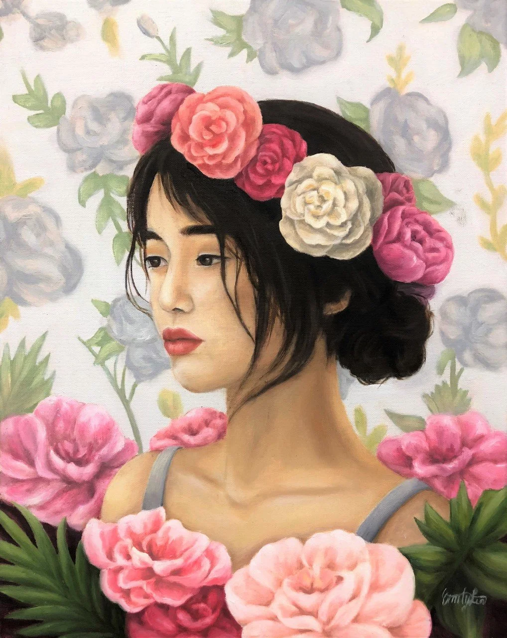
I took a picture of the flowers that I had bought and reimagined it into the current painting. I wanted to utilize a lot of contrast to symbolize hope in the darkness and the contrasting feelings I felt in the turmoil of adjusting to college life. I also focused a lot on the composition and accentuated some flowers over others to represent different priorities and outlooks. The bouquet itself is not a perfect bloom but rather a combination of wilting and blossoming ones, representing different aspects of life, as it cannot always be perfect. I painted this in our building’s lounge when I had free time.
When I began my first few months at UCLA, I struggled with self-doubt and a sense of displacement. College came with both newfound freedoms and heavy responsibilities, but it also left me feeling lost. I faced rejection from several clubs, felt uncertain about my career path, and even felt alienated in my own room. After one particularly difficult day, I bought a small bouquet of carnations at Trader Joe’s as a simple act of self-care. This gesture was more than just a way to lift my spirits; it became a symbol of my determination and hope for what was to come. I decided to paint those flowers as a reflection of my journey of independence, growth, and self-discovery amidst the rollercoaster ride of adjusting to college life. It was a way of taking those tough moments and transforming them into a celebration of resilience and personal transformation.
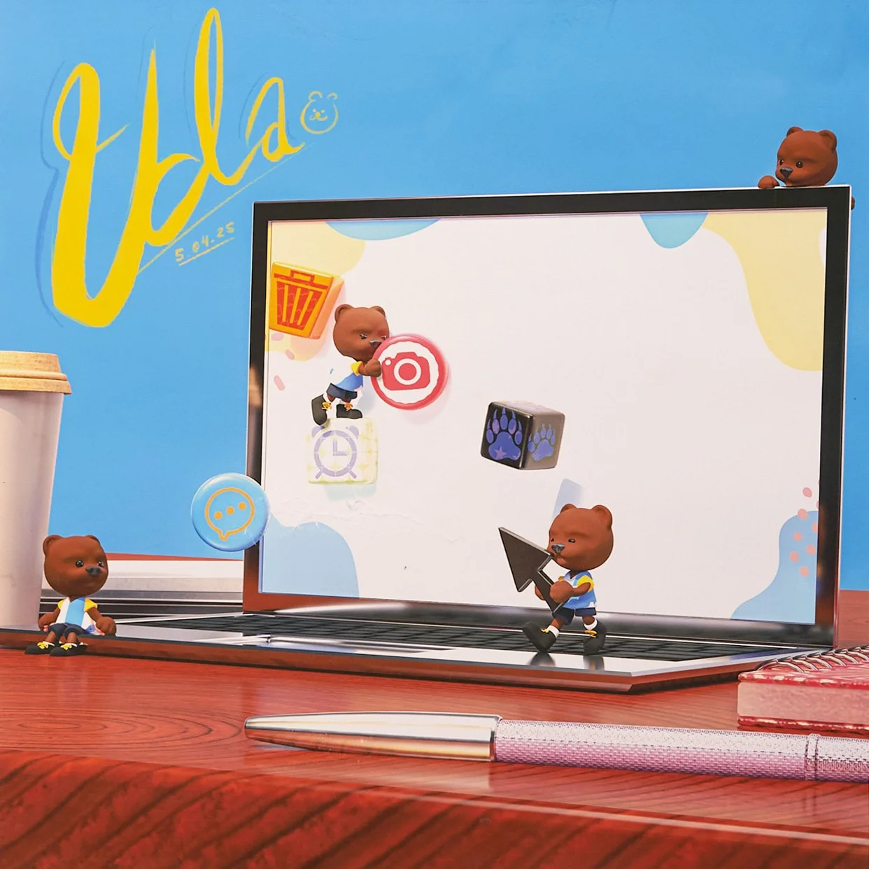
Diane Park “Bearing Multi-Tasks”
First Year, Film
I used procreate, substance stager, substance painter, and Maya.
I wanted to try using 3D art as a medium. When I think of technology, I think about studying on my iPad, where I usually have multiple tabs open—it’s often hectic. I imagine little bears managing all the different tasks.
2024 Winners
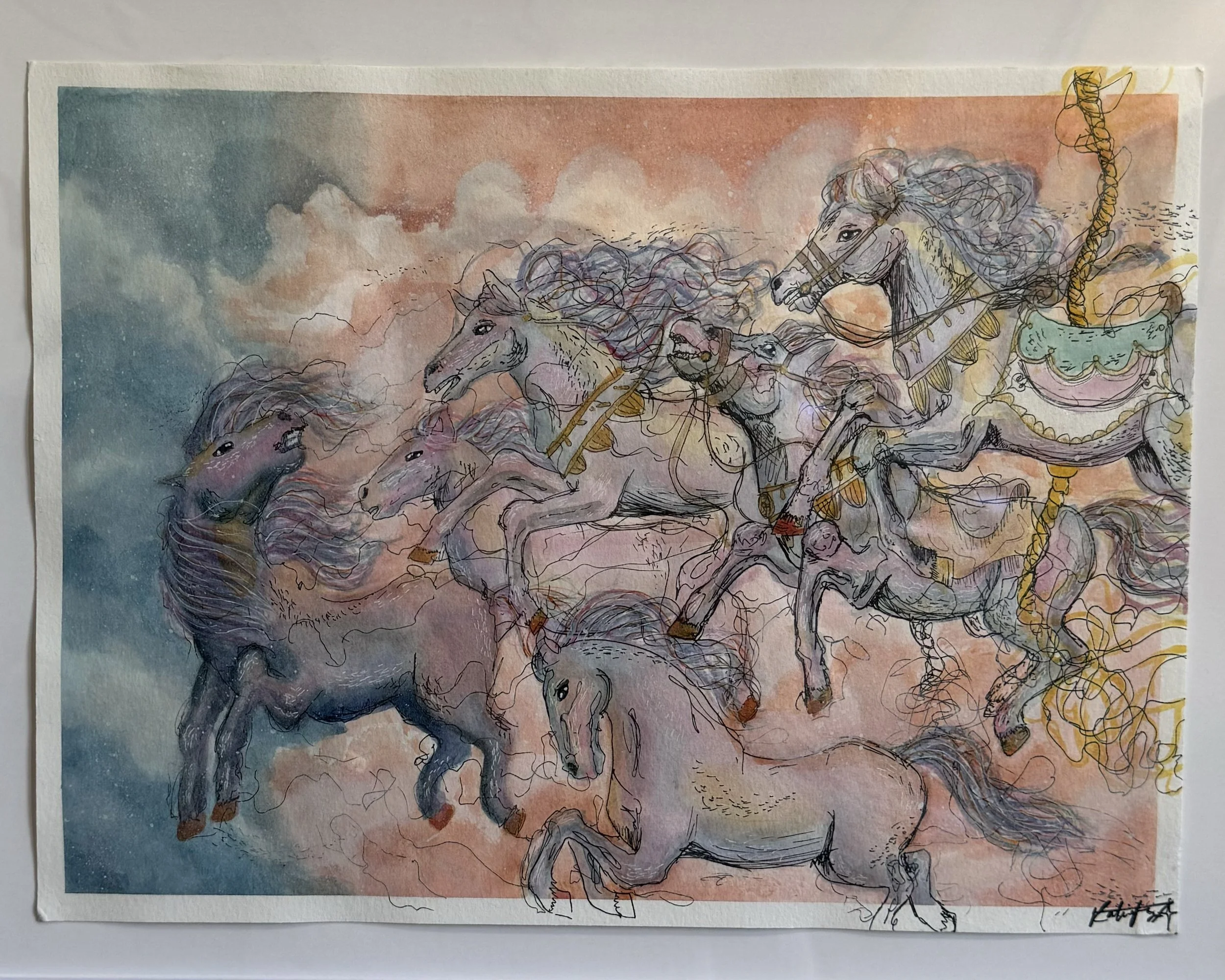
Katie Fang “Carousel”
Second Year, World Arts and Cultures
I created this painting in multiple layers, first sketching the detailed carousel horses with black ink, then bringing it to life with watercolors, and finally painting the clouds in the background. To add more texture and dimension, I illuminated the horses' accessories with a gold metallic shimmer.
Through this piece, I aimed to convey the sense of liberation we gain as we grow up. Whenever I think of a merry-go-round, I am struck by a sense of nostalgia because it was my favorite ride as a kid, so I used warm, gentle colors to create a dreamy atmosphere. The peach-colored clouds progress into a cool blue to illustrate the uncertainty and ambiguity of adulthood in comparison to our childhood days. In the flow of the painting, the horses on the right side are embellished with heavy ink outlines and excessive mark-making, as well as accessories and carousel poles. As the horses gallop across the background, the lines become sparser and their accessories fade away: they break free from the carousel’s confines and run on their own path without reins or saddles. Although the future is undefined, we must move forward with resilience and seek the moments of sunlight streaming through storm clouds.

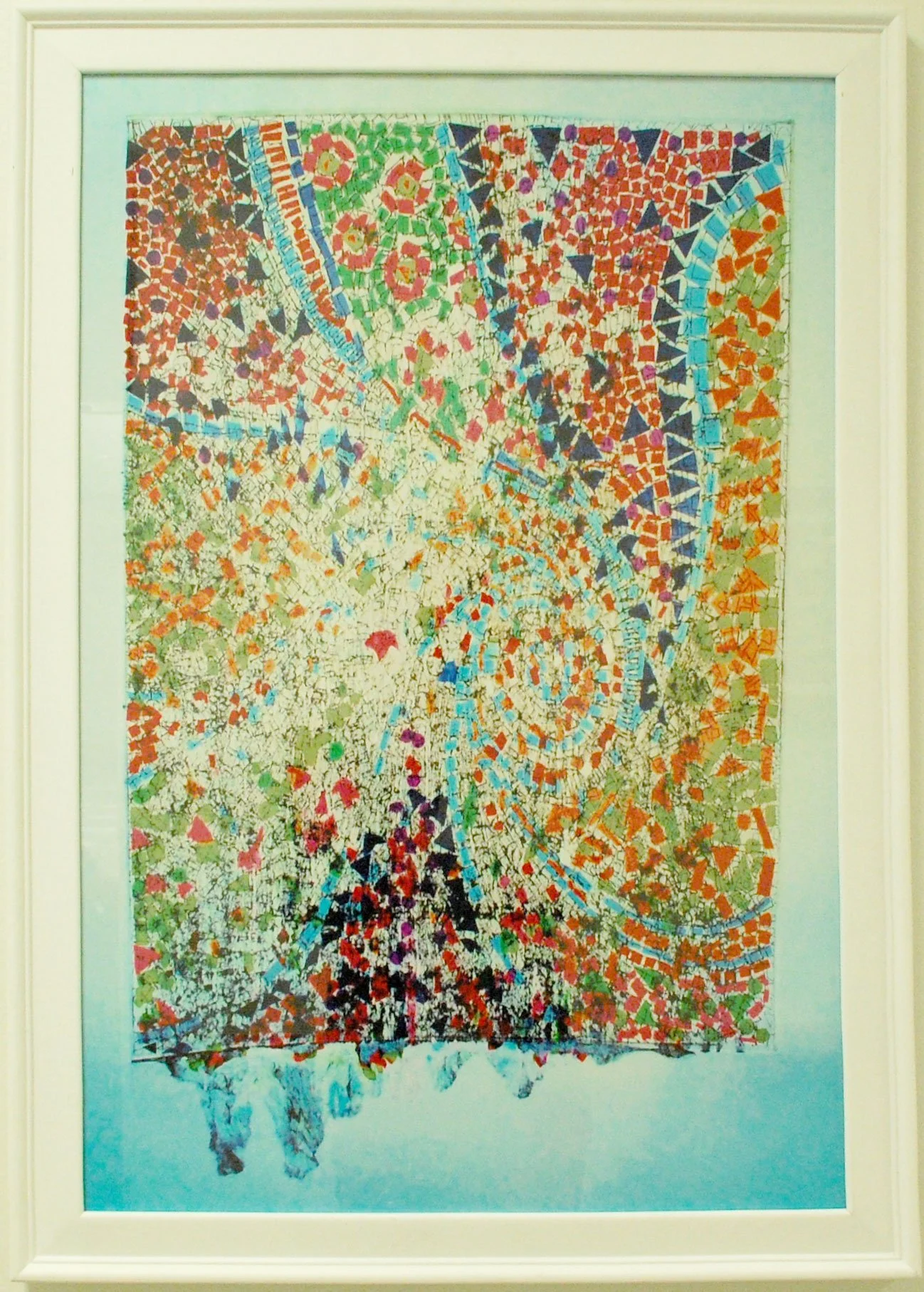
Yifei Wu “Half the Sky”
First Year, Art
Before beginning this project, I conducted research on Nüshu, the script traditionally used exclusive by women, and honed my skills in calligraphy by practicing its form. Building upon this foundation, I explored cyanotype techniques and developed a method to incorporate calligraphy into cyanotype printing. I applied this technique by transferring symbols and elements representing femininity onto specially treated fabrics using cyanotype. Finally, I hand-sewed these fabric pieces together to create a cohesive whole.
Nüshu, the women's script, is the syllabic script that was invented and used exclusively among ethnic Yao women in Jiangyong County, Hunan, China, before going extinct in the early 21st century. This secret language between women creates a safe space for them to escape from feudal power suppression, allowing them to recover their pure nature. The first time I saw the women's script, I was fascinated by its femininity and naturalness. The strokes of the brush are like dense willow leaves and flying birds. I intend to revitalize this beautiful language, show my respect for the struggle for freedom and independent will of women who once lived on Chinese soil, and contribute to the cultural preservation of this intangible cultural heritage.
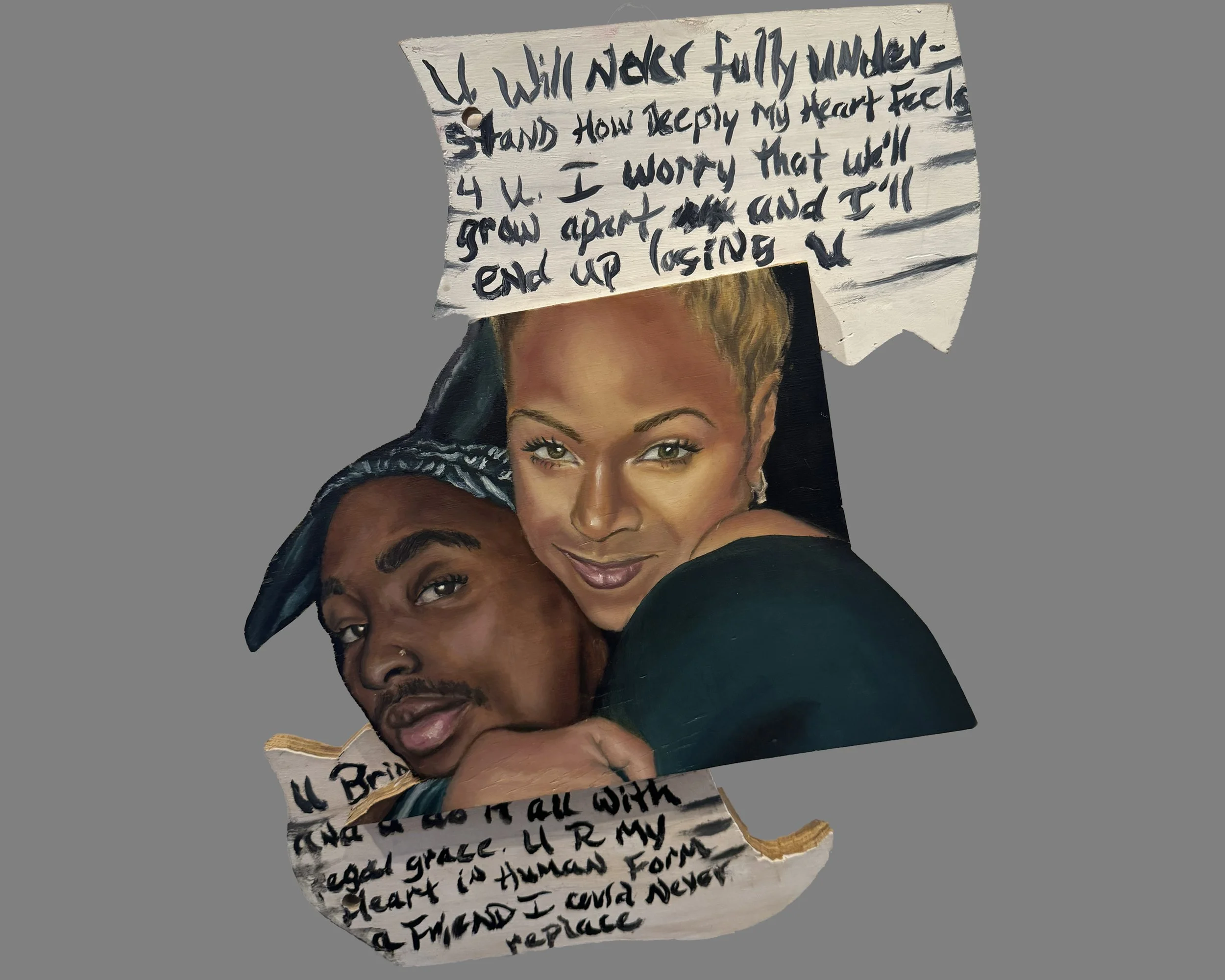
Maia Faith Hadaway “A Friend I Could Never Replace”
Fourth Year, Art
I first drew an outline for my envisioned design and carved the drawing out using a bandsaw, jigsaw, and sander to transform my wooden surface into three different shapes--the top and bottom portions of the paper and the two embracing figures. I then used wood glue to arrange the pieces into one sculptural form and prepped the surface for painting.
I’ve always admired Tupac and Jada’s platonic friendship seeing parallels with my own close bonds with those I call brothers. I aim to portray the intimacy in their relationship beyond celebrity status, prioritizing their human connection.
The divided and damaged letter reflects not only its discovery but also their relationship torn apart by his untimely death. Untimely—a word often forced upon many within the black community. Despite the division, she holds on tightly, refusing to let go.
This piece wasn't solely about them, but rather about their humanity. It explores the impact of her love on him beyond romance, leading him to write genuinely heartfelt words. Never delivered, it’s a journal entry, not a letter.